CI/BI

A big life difference made with small changes
TRUE’L’s value starts with you.

  • 2006Established brand

  • 2015Renewed brand

  • 2020Intensifying the brand value

  • Symbol

    The blue circle bursting up from the bottom to the
    top shows communication and harmony.
    The red triangle toward the top means continuous
    pursuit of change and dynamic company culture.
    There is meaning of Il Sung’s will to be a top-ranking company trusted by customers, an innovative company to create a good culture and a global company beyond Korea.

Signature
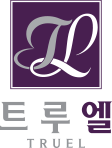
  • Symbol

    We visualized TRUE as an unbreakable promise with customers with the meaning of “Building and Caring with Sincerity”, by connecting the two letters T and L like a knot.

    We have designed the logo to be as simple as possible by securing a classic serif that emphasizes luxury with an easy and stable font and thick stroke.

Color Design
    • C

      83

    • M

      100

    • Y

      52

    • K

      23

    • C

      36

    • M

      44

    • Y

      56

    • K

      0

Color Story

We used purple that contains the sincerity contained in TRUE’L (blue) and the exciting change that customers will enjoy (red) to express the ‘relaxing and enjoyable life’

The main value of the brand is to realize the dignified life you will enjoy in TRUE’L by using the original luxury of gold color.

It can be viewed as a small change,
But a wonderful experience and a pleasant difference that you feel, the more you live!
We make our imaginations to come true with small changes to our lives

A big difference in life made with small changes!
TRUE’L’s value starts with you

  • TRUE’L looks closely
  • TRUE’L thinks
  • TRUE’L makes

Core value of Brand

  • THE PERFECTION of TRUE-LIFE
  • TRUE’L stands for customers’ true life, meaning a happy and valuable life

    A valuable life with small changeslogo

True Life is lived when tiny changes occur

- Tolstoy -